LLNL expands release of energy flowcharts
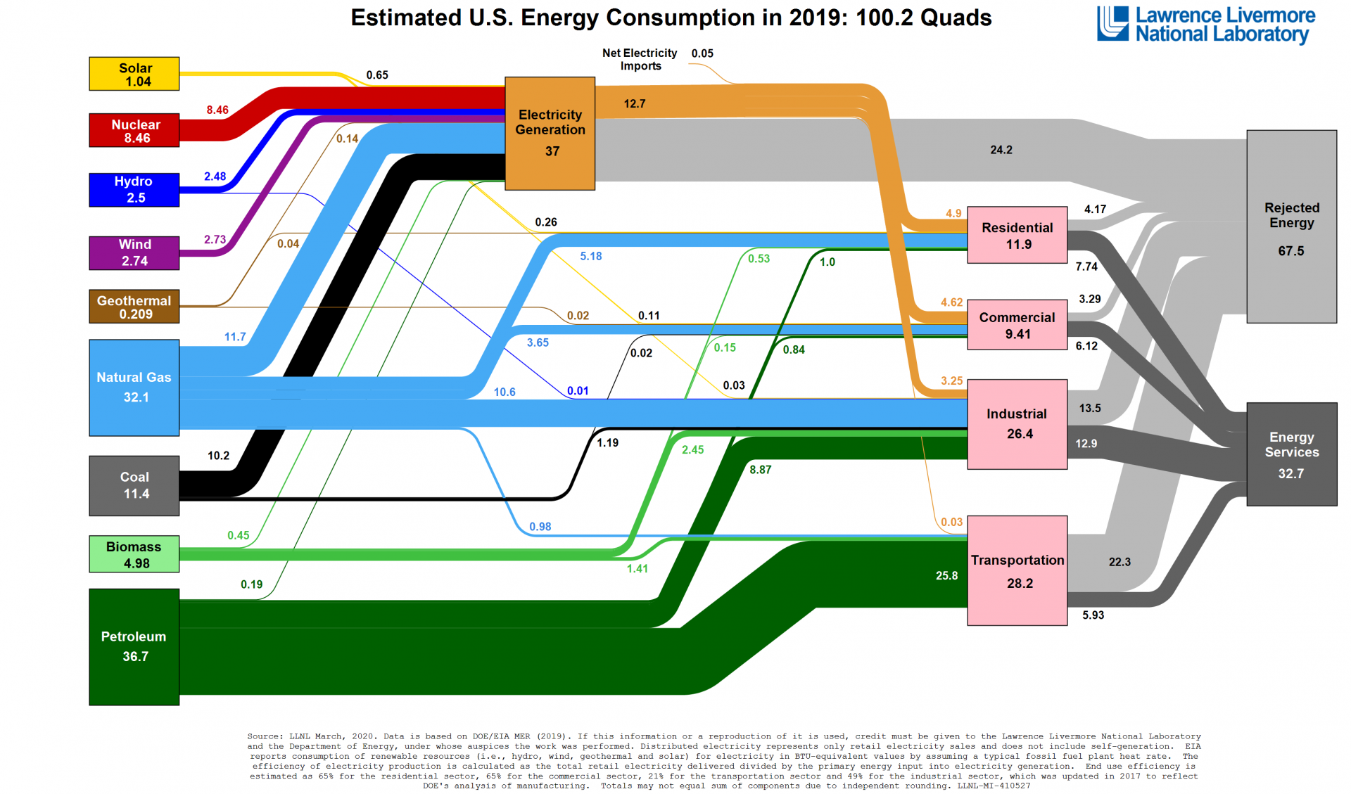
This flowchart is housed in a library of Sankey diagrams at flowcharts.llnl.gov and is also available as a PDF. Source: Department of Energy/LLNL, based on EIA data
Every year, Lawrence Livermore National Laboratory releases flowcharts illustrating U.S. energy consumption and use. The flowcharts, called Sankey diagrams, allow scientists, analysts, and other decision makers to compare the contributions made by various energy sources, including nuclear power, and the end uses of those sources, including residential, industrial, commercial, and transportation markets. Taken as a series of annual snapshots, energy use trends and opportunities quickly become apparent.
This year, in addition to releasing the 2019 energy flowchart, the lab issued state-by-state energy flowcharts for 2015–2018 and carbon emissions charts for 2014–2017. It is currently at work on charts of international energy use that it hopes to release by the end of the year.



.jpg)
